What I learned watching the video is that when creating or designing a new logo, you have to just write, draw, and endlessly play around with shapes and letters. The more you do this the more options you will be able to choose from in an effort to generate an awesome design. Just by writing things out you may help spark and idea or see something you didn't see before that can easily relate back to the brand. After that just keep sketching!! Once you find a design or two or three that you think have true potential, go into illustrator and start mocking them out. Illustrator is key because you can make the images bigger or smaller without losing the quality of your design. Aaron makes a good point about always making a copy so that you always have something to revert back to if one of the designs starts to fall apart. In this program you can easily play around with colors and fonts. The most important things is to remember to have fun. Try to spark inspiration from old books of logo designs, and never give up. It's okay to step away in order to clear your head. Sometimes we get so wrapped into the design we are working on that we have a hard time seeing other possibilities. Stepping away helps clear your head so you can come back a little more refreshed. Just remember to keep at it, and soon you will have an amazing design!!
|
Coca-Cola is such an iconic brand which I personally love because they started with an idea and they haven’t steered too far off from the original idea. One of the fonts they used from the beginning is still used to this day. Frank Mason Robinson is the creator behind the design using a Spencerian Script. The only variations we have seen over the years were taglines being incorporated (to stay relevant with the times) and the Red background with the white type to help improve readability. Other than that, the brand’s logo has remained the same, and the brand is one of the most, if not the most, well-known brands in the world. 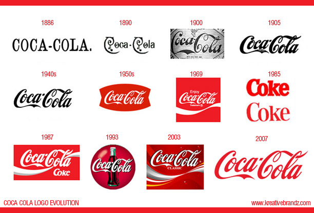 “American Messenger Company” was founded in 1907 which later changed its name to “United Parcel Service” in 1919. Every logo, from the beginning, always incorporated a shield to ensure safety of their product. The very first logo was a shield with an eagle carrying a package with a label reading “Safe, Swift, Sure.” The trucks carrying their packages were painted brown although the original idea was to paint them yellow, but that idea was quickly turned down. In 1937, they decided to simplify the logo to the shield with UPS in the center with a message reading “the delivery system for stores of quality.” They also added “Since 1907” to enhance their experience. To simplify it more, they redesigned in 1961 to just a shield with UPS in the center and a rectangular package with a bow right above it. They wanted to try to create a logo that most people could identify with, so that is why they incorporated a gift package. Later on in 2003, the logo was redesigned once again to just the shield with UPS in the middle. They incorporated brown and yellow into the design as well as a curve within the shield to suggest world-wide service within the company. 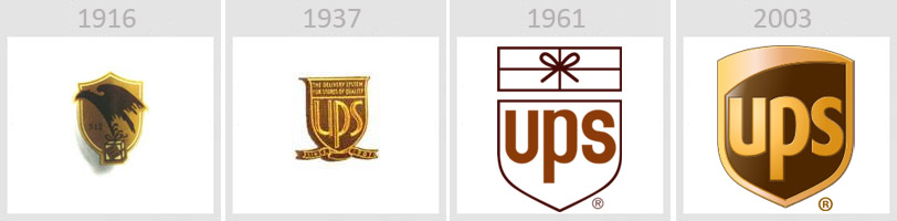 The Brand name Lego derived from a Danish saying “Leg Godt” which means “Play Well.” The company had many variations of its logo from 1934-1950 before it started to take shape into the logo we know today. The original variations contained “Billund, Denmark” which is where the Lego headquarters is located. In 1953 we began to see the logo take shape with the bulky lettering with the red background and the two dots with the black line connecting them. All the way up until 1964 the logo also contained “System” underneath the brand name. In 1973, they removed “system” which was written in yellow, and decided to outline “Lego” in yellow which helped it stand out against the red background. The Logo we know today is slightly slimmer and closer together. Legos is definitely an iconic brand which has been around for many years. 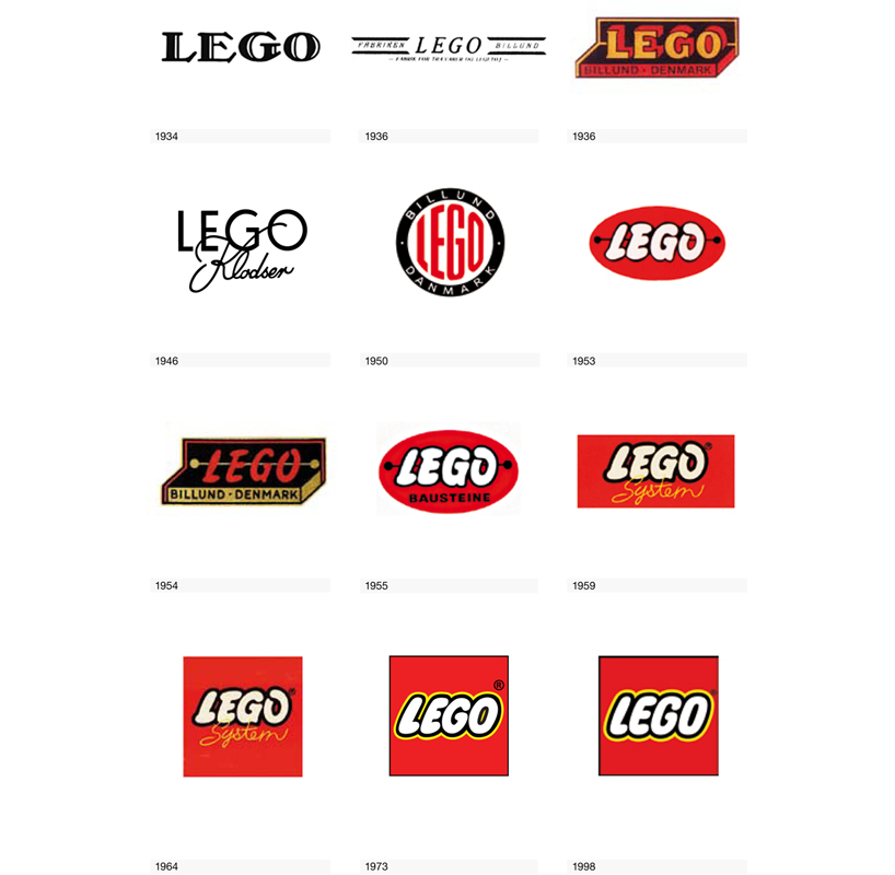 Around the 1890’s a man named Marcus Samuel worked in a trading company that specialized in antiques and seashells. As he branched off from his current company he created his own with the name “Shell” Transport & Trading Company, and thus the brand name originated! The very first logo was a realistic depiction of a mussel shell, and later changed to a scallop shell. Around 1907 the company merged with the Royal Dutch Petroleum Company and became the Royal Dutch Shell Group. They chose to stick with the scallop shell and dubbed “Shell” as their brand name. Overtime they steered away from the realistic look of the shell and adopted Red and Yellow as their colors. Reasons behind the colors vary depending on who you ask. One theory is that they represent the colors of Scotland which happened to be one of the founder’s heritage. The other theory is that the colors represent Spanish heritage which many Californians originated. Neither theory have been confirmed, so it remains a mystery. As the company started to gain popularity in the 1940’s, they incorporated the brand name into the Logo. The logo changed slightly over the next few decades; mostly the brand name moved from inside the shell to underneath the shell. As of 2000 the company has become so widely known that the brand name has been removed because it has become one of the most recognized logos in the world. 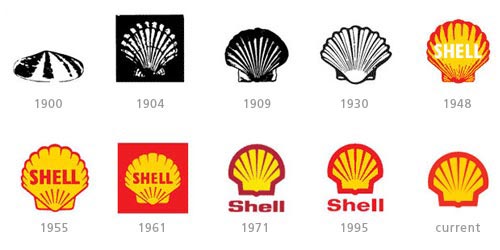 |
AuthorMy name is Erin and I am currently a student at Virginia Commonwealth University Archives
November 2015
Categories |
 RSS Feed
