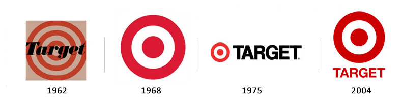
Target derived from the Dayton Dry Goods Company and was first opened in 1962. The director at the time, Stewart K. Widdess and his staff quickly came up with the name a few month before the store actually opened, and from the beginning the bulleyes logo was envisioned for the company. The original logo, from 1962, was 3, red, open rings and “Target” written in black centered within the rings. To improve readability “TARGET” was moved to the side of the logo and put in all-caps. The rings were eventually narrowed down from 3 to just a single red dot and one open ring. In 2000 they decided to just use the color red, and as the brand itself became iconic with the bulleyes, “TARGET” was eventually dropped altogether.
When creating a logo you need to take into account many different things. You need to think about who you are creating this logo for. Who are they? What do they represent? What is going to be appropriate for their brand? Will the logo work in a small scale? Will it work on a large scale? This are important questions because this logo may have to be versatile, and what you have in mind might not work for who the brand is. Once you start the design phase you need to play around with many forms and methods. Try writing the name out and start looking at it in different ways. One example in the video was from Kelli Anderson when she design “Off Book.” She wrote the name out on paper and just began folding it and photocopying it. After playing around for a while the final image emerged and from there they just played around some more with color and opacity. You can’t always use pen and paper to try and generate ideas. At the end of the video they talk about timelessness. What makes a logo timeless? Timeless is something that can transcend through generations and still feel like it belongs. Coca-Cola was an example because throughout the years even though the logo has changed, the font has always remained the same. Not all logos are timeless, but if you want a logo you design to be, you have to think about how it could potentially be viewed in the future.
Interesting fact: the predecessor to Google was known as “Backrub” and the logo was just an image of Larry Page’s own hand… The name “Google” apparently derived from the mathematical term “googol” which is the number that is represented by the numeral one followed by 100 zeros. This was meant to represent the amount of information a person could find using “Google.” The very first versions of Google’s logo were created by Sergey Brin using an editing program called GIMP. The logo really hasn’t changed much over time, but one variation did include and exclamation mark which was supposedly inspired by Yahoo!. The colors have all stayed the same and only the shading and shapes of the letters have changed over time. Naturally, from time to time, as we all have seen, Google has created “Google Doodle Logos” which are decoration and typically created for special occasions, birthdays, and holidays. There have apparently been over 1,000 of these Google Doodle Logos!
Levi, also known as Levi Strauss & Company, is a brand that has been around since 1860’s formed by Levi Strauss and his brother-in-law. At first, the company only sold Overalls, but in the 1920’s the company began selling their iconic jeans. The very first logo they came up with was a very detailed image of two horses being driven in opposite directions which are both pulling on a pair of jeans meant to show durability. That logo can still be seen today on Levi jeans. Since the original logo was so complex the company needed to derive a more simplified logo for branding purposes. Over the course of a few decades the company went from LEVI’S written in all black, to LEVI’S written in white on a red background (the E slightly slanted). Eventually they changed the red rectangle and modeled the outline to the stitching in their jeans, still with the white writing. It wasn’t until recently they decided to remove the brand name altogether on the Curve ID product line. I personally feel the logo isn’t iconic enough to be left without the brand name because the image doesn’t resemble much, but I could definitely be wrong. I feel as though they should continue with the logo from 2000.
Hewlett Packard Co. was founded back in 1939 by Bill Hewlett and Dave Packard. They began their company in a small garage and chose the order of the names based on a coin toss. Packard-Hewlett would have been a little weird, so thankfully it was the other way around. From the beginning the company had already adopted “hp” as a part of their brand image and logo which was extremely simple, only containing their brand name “Hewlett-Packard” with “hp” above or in the middle. It wasn’t until 1967 that they decided to reimage their logo to be a little more contemporary. It was simplified to a rectangle with “hp” in the center. Sadly, this design did not fit most of their products and they had to redesign once again. The updated design kept a smaller version of the “hp” rectangle, but they incorporated Hewlett Packward (stacked) on the side. This design worked really well, but in 1999 the company split into two companies. From then on they dropped “Hewlett Packard” and just kept “hp.” For a little while they incorporated “invent” into the logo since they were innovating technology, but in 2008 they dropped that as well. The latest design pulls inspiration from their original design which had “hp” in a circle, and is the design we know today.
Nike is a brand that we all know and can easily recognize. The name Nike was derived from a Greek Goddess of victory, expressing ambition and a strong will to win. The company was founded in 1964 by Bill Bowerman and Philip Knight and was introduced in 1971. Ironically, when the “swoosh” was created by Carolyn Davidson, inspired by the winged goddess, Philip Knight “Okayed” the design because he was rushed to make a decision. He said, “I don’t love it, but it will grow on me.” Little did he know how symbolic this “swoosh” was going to be! The original logo, in 1971, was the “swoosh” with Nike written overtop of the design in a lowercase font. Later on in 1978 they placed the “swoosh” at a different angle to highlight the new All-Cap “NIKE.” After over 25 years of use, the image itself defines NIKE, and it instantly recognizable. From 1995 on, the NIKE name has been removed from the logo.
|
AuthorMy name is Erin and I am currently a student at Virginia Commonwealth University Archives
November 2015
Categories |