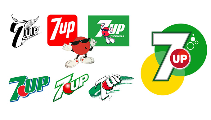
The very first logo for 7UP was a “winged” design on the 7UP logo. It was black and white and used a 3D font. In the 1930’s they removed the wings and added a red background to the design and implemented a few bubbles. This designed remained for a few decades until they launched the “Uncola” in 1967. From here they removed the 3D type and gave it a flat dimension. Later on they added a Red Dot which they started to animate and called it “Spot.” It became a mascot of the brand, and later on when they changed the background from red to green, in 1990, the Red Dot started to become iconic of the brand itself. As graphic design started to become more popular, we can see their design change quite frequently over the next few years playing around with drop shadows, 3D effects, and different designs. Around 2011, they brand decided to bring it back to the simple fact that their product contains 7 simple ingredients and began playing around with green and yellow circles to signify “Lemon and Lime.” They latest design actually has the circles looking like a Lemon and Lime slice. With a big number 7 and two green and yellow circles, the red dot remains at the center of the logo with “up” written inside.
Watching the tutorial I have learned that anything you can imagine can be made from just about anything. The use of negative space allows for much more creativity and a more in-depth design. A simple letter can become something more than just a letter. Once you begin playing with negative space you can add something more dynamic such as the letter “a” becoming an apple, or the letter “g” become a sprouting bean. One must be able to see the potential in order to bring out the design that lies within. I aim to take what I have learned from this tutorial and apply it to my last logo design.
Burger King was founded in 1954 in Florida, and their first logo design, which could be seen on top of their first store was a King sitting on top of a burger above the sign “Burger King, Home of the Whopper.” This design remained until about 1969 where they created a burger in the design. There were two buns and in between the buns was “Burger King” in a red bubbly font to represent the meat. Although the King was removed from the logo, he continued to play a key role in the commercials and ads. In 1994, they slimmed the font down a little in the design, but not much changed. It wasn’t until 1998 that they made the buns a little shiner, titled it slightly to the left and added and blue swirl around it to give it a global feel.
The original name of Pepsi used to actually be “Brad’s Drink” named after the founder, Caleb Bradham, but he changed the name to Pepsi Cola in 1898. Bradham’s neighbor helped him design the very first logo which had a very interesting font and design to it. The logos stayed pretty simple for many years until about the 1940’s when CEO Walter Mack suggested to implement the bottle top design into the logo. The colors Red, White and Blue were used to help support the war efforts at the time, and just stuck with the brand ever since. Another big change came in the 1960’s when they went from Pepsi Cola to just Cola and steered away from the curly scrip in order to better differentiate themselves from Coca Cola. Eventually the cap would disappear and a globe shape took its place. The company continued to play around with the blue and red added boxes here and there and shifting them around until in 1996 the company decided to take on “Project Blue.” Everything rolling out with Pepsi on it would have an all blue background, White font, and the globe with both (red, white and blue colors). This was the best decision they could have done since Coca Cola was predominantly Red, they were able to claim “Blue” as their own. The newest logo, introduced in 2008, has grabbed pieces of the old designs. They took away the “wave” within the globe and moved the “wave” to the letter “e” and now the globe is supposed to have a shape within it to resemble a “smile.” Different types of Pepsi drinks used to have a varying smile within the globe, but they wound up simplifying it and using the same on for each drink in the future.
This company was founded by Frederick W. Smith in 1971 with the name of Federal Express at the time. He chose “Federal” in the name in emphasize that his company delivered nationwide. It began only using airplanes out of Memphis International Airport, and continued to do so for many years. The first logo was all caps “Federal Express” using the colors red, purple, and white placed diagonally in a rectangle. In 1994, the company had a chance to rebrand and decided to adopt the name FedEx since that was what people had nicknamed the company. They strategically placed a hidden arrow in between the “E” and “x” hinting that they were moving in the “right” direction. Around 1998, the company was able to branch out in logistics after acquiring the Caliber System Inc. forming the FDX Corporation. From here they kept the same logo design, but added a different color “Ex” depending on the business unit. Express (purple), Ground (green), Freight (red), Custom Critical (blue)… etc. The only difference from 2000 to 2006 is the font used for their business units.
|
AuthorMy name is Erin and I am currently a student at Virginia Commonwealth University Archives
November 2015
Categories |