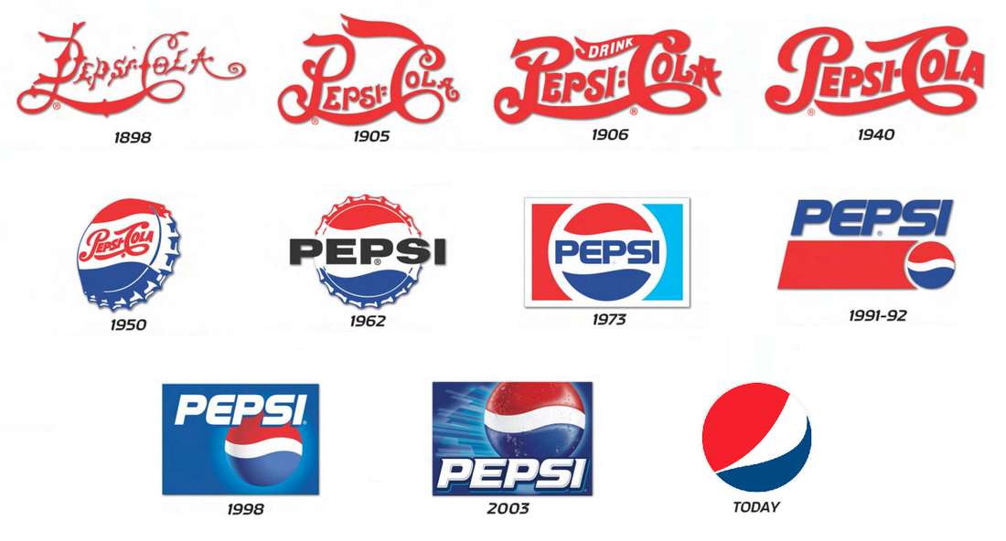
The original name of Pepsi used to actually be “Brad’s Drink” named after the founder, Caleb Bradham, but he changed the name to Pepsi Cola in 1898. Bradham’s neighbor helped him design the very first logo which had a very interesting font and design to it. The logos stayed pretty simple for many years until about the 1940’s when CEO Walter Mack suggested to implement the bottle top design into the logo. The colors Red, White and Blue were used to help support the war efforts at the time, and just stuck with the brand ever since. Another big change came in the 1960’s when they went from Pepsi Cola to just Cola and steered away from the curly scrip in order to better differentiate themselves from Coca Cola. Eventually the cap would disappear and a globe shape took its place. The company continued to play around with the blue and red added boxes here and there and shifting them around until in 1996 the company decided to take on “Project Blue.” Everything rolling out with Pepsi on it would have an all blue background, White font, and the globe with both (red, white and blue colors). This was the best decision they could have done since Coca Cola was predominantly Red, they were able to claim “Blue” as their own. The newest logo, introduced in 2008, has grabbed pieces of the old designs. They took away the “wave” within the globe and moved the “wave” to the letter “e” and now the globe is supposed to have a shape within it to resemble a “smile.” Different types of Pepsi drinks used to have a varying smile within the globe, but they wound up simplifying it and using the same on for each drink in the future.
 RSS Feed
