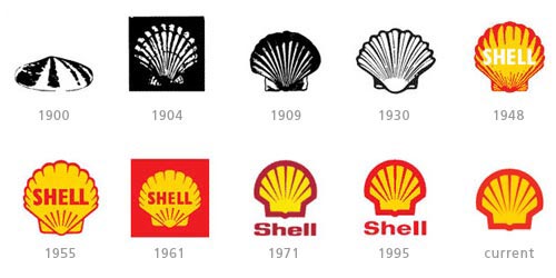
Around the 1890’s a man named Marcus Samuel worked in a trading company that specialized in antiques and seashells. As he branched off from his current company he created his own with the name “Shell” Transport & Trading Company, and thus the brand name originated! The very first logo was a realistic depiction of a mussel shell, and later changed to a scallop shell. Around 1907 the company merged with the Royal Dutch Petroleum Company and became the Royal Dutch Shell Group. They chose to stick with the scallop shell and dubbed “Shell” as their brand name. Overtime they steered away from the realistic look of the shell and adopted Red and Yellow as their colors. Reasons behind the colors vary depending on who you ask. One theory is that they represent the colors of Scotland which happened to be one of the founder’s heritage. The other theory is that the colors represent Spanish heritage which many Californians originated. Neither theory have been confirmed, so it remains a mystery. As the company started to gain popularity in the 1940’s, they incorporated the brand name into the Logo. The logo changed slightly over the next few decades; mostly the brand name moved from inside the shell to underneath the shell. As of 2000 the company has become so widely known that the brand name has been removed because it has become one of the most recognized logos in the world.
 RSS Feed
