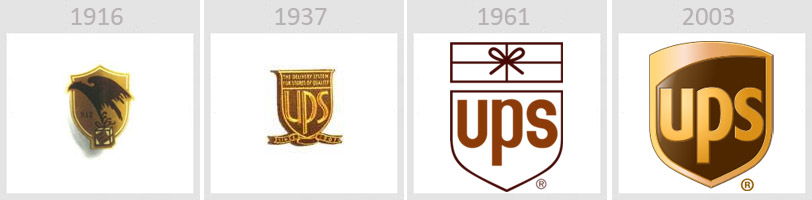
“American Messenger Company” was founded in 1907 which later changed its name to “United Parcel Service” in 1919. Every logo, from the beginning, always incorporated a shield to ensure safety of their product. The very first logo was a shield with an eagle carrying a package with a label reading “Safe, Swift, Sure.” The trucks carrying their packages were painted brown although the original idea was to paint them yellow, but that idea was quickly turned down. In 1937, they decided to simplify the logo to the shield with UPS in the center with a message reading “the delivery system for stores of quality.” They also added “Since 1907” to enhance their experience. To simplify it more, they redesigned in 1961 to just a shield with UPS in the center and a rectangular package with a bow right above it. They wanted to try to create a logo that most people could identify with, so that is why they incorporated a gift package. Later on in 2003, the logo was redesigned once again to just the shield with UPS in the middle. They incorporated brown and yellow into the design as well as a curve within the shield to suggest world-wide service within the company.
 RSS Feed
