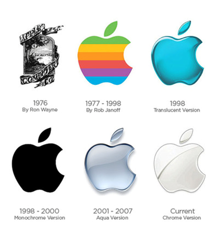
Believe it or not, but Apple's very first logo was way more complex than what it is today. It began as a boy sitting under an apple tree! Since the design was difficult to reproduce on a massive scale, they simplified the design to a rainbow colored apple with the brand name "apple" coming out of the side. The rainbow design was a way for Apple to show that their monitors came in many various colors which was very appealing to the younger generation at the time. After a few years they dropped the "apple" altogether once it became iconic enough. Surprisingly the reason behind the "bite" in the apple design was meant to help distinguish it from a cherry. From 1998 and on Apple's design became more monochromatic and less colorful as their iMac's were released and their computer designs became more refined.
 RSS Feed
