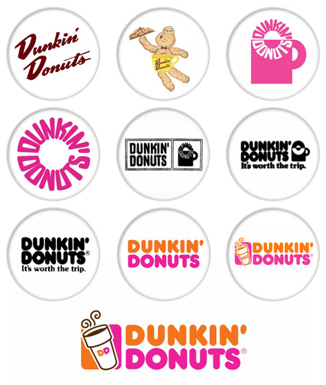
In the 1950’s, Dunkin’ Donuts’ first logo consisted of “Dunkie” which was a cheerful character serving coffee and donuts with the brand name “Dunkin’ Donuts” next to it. The road signs logo, at the time, consisted of the brand name stacked. In 1965, they redesigned the logo with the brand name stacked, and coffee cup with the words “Dunkin’ Donuts” formed in a circle as if being “dunked” in the cup. Each element of this design were meant to be able to be standalone if necessary. A few years later they took away the text within the circular design but kept the layout of it. Still something seemed to be missing. In the 80’s, a woman named Lucia N. DeRespinis, who worked at Sangren & Murtha, suggested that the colors were too “toasted” and that since donuts are meant to be fun, so should the brand and logo design. She suggested keep the design, but adding in her daughter’s favorite colors, pink and orange. Later on a to go coffee cup was added with steam coming out because the Vice President, Ken Kimmel said that “While coffee and donuts are core to our business. Neither stands alone.” The last logo design is still the same except that the coffee was simplified with “DD” on the cup, and they added in the coffee color inside the cup.
 RSS Feed
