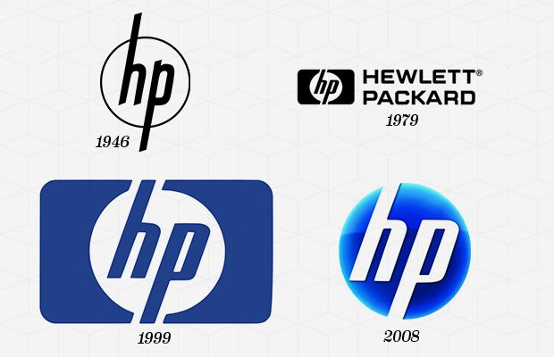
Hewlett Packard Co. was founded back in 1939 by Bill Hewlett and Dave Packard. They began their company in a small garage and chose the order of the names based on a coin toss. Packard-Hewlett would have been a little weird, so thankfully it was the other way around. From the beginning the company had already adopted “hp” as a part of their brand image and logo which was extremely simple, only containing their brand name “Hewlett-Packard” with “hp” above or in the middle. It wasn’t until 1967 that they decided to reimage their logo to be a little more contemporary. It was simplified to a rectangle with “hp” in the center. Sadly, this design did not fit most of their products and they had to redesign once again. The updated design kept a smaller version of the “hp” rectangle, but they incorporated Hewlett Packward (stacked) on the side. This design worked really well, but in 1999 the company split into two companies. From then on they dropped “Hewlett Packard” and just kept “hp.” For a little while they incorporated “invent” into the logo since they were innovating technology, but in 2008 they dropped that as well. The latest design pulls inspiration from their original design which had “hp” in a circle, and is the design we know today.
 RSS Feed
