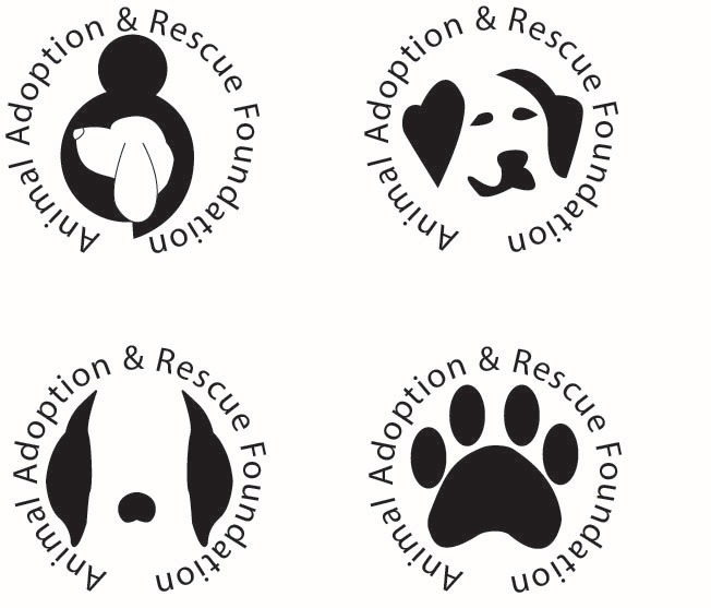
Negative Space is a technique I have rarely played around with. This round of concepts was a little difficult, but I feel as though only so much can go into it before it becomes too much for the eye to see. I tried to keep it simple with the idea in the back of my head that the logo I may choose to move forward with could possibly work with portions being "punched" out and still keep the design shape. I want this design to be different, but different in a way that hasn't been utilized much. I think I know which one I want to move forward with, so next weeks design should look pretty cool once I put it in my final layout!
 RSS Feed
